Wednesday, 29 April 2015

Typography exploration

Typography exploration

     Typography. It can express the energy that a word gives, sounds, or even feels. Using Adobe Illustrator CS6, we were given the task of picking a word and picking out the details to help express what that word represents in terms of feelings, mood, sound, etc. The word that I picked was "Utopia".

The word "Utopia" (pronounced UU-Toe-pEE-AH) is defined as an "imagined place or state of things in which everything is perfect."

     When I hear the word "Utopia", I envision a tropical hideaway far from the loud hustle-bustle of modern living. Somewhere like a island in the middle of nowhere with a cascading waterfall, lush flowers, chirping birds, etc. I hear the gentle breeze, the melodic strings of a harp being plucked by that of a gentle, long-haired, kind goddess, and the beauty of nature being exposed fully.

    The type of font as well as it's composition and format is crucial to helping convey the intended message and express the feeling of a piece of text. I downloaded a font off of a website to use so that way I could open my options up as much as possible for finding the "perfect" font. I used "Scriptina" font for the word "Utopia" at size 107.53 points. I changed the colouring of each letter in the word "Utopia" to create a range of colours that mimic a rainbow. I used mostly light colours, however, to create a light sense rather than having heavy dark colours hanging on the screen. I placed the word to the mid-left of the screen to create a "rule-of-thirdsworthy" balance (having something not directly centre for visual interest). I then type my description of the word "Utopia" underneath with a bit of space in-between as to let the text have some room to breathe. The description was "Lao Sangam MN" font, size 16 points.

     In conclusion, I really enjoyed the concept of the given work, and I hope to learn more and try new options when it comes to typography as well.

     Down below is my typographic creation of the word "Utopia", as well as an image coupled with some audio that I thought perfectly define how I envision the word "Utopia".


Seen to the left: the typographic image that I created of the word "Utopia".


Seen to the left: an image that helps define how I envision the word "Utopia".


Seen to the left: an audio track that helps define how I envision the word "Utopia".

Tuesday, 14 April 2015

CyberARTS weekly blog post #5

CyberARTS weekly blog post #5

Creative recordings- The Daily Create 

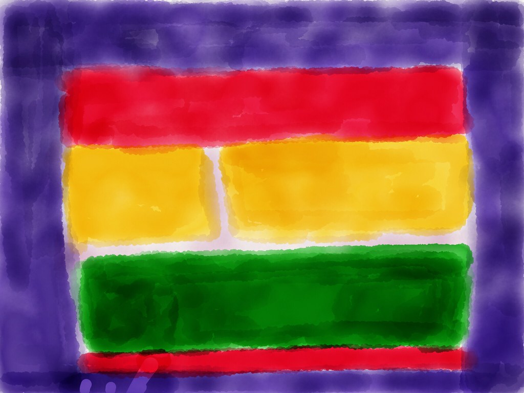
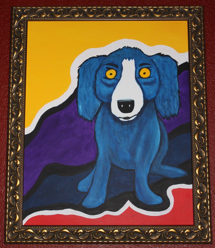
      Everyone knows famous artists such as Vincent Van Gogh, Jackson Pollock, Leonardo Da Vinci, etc. Not only are such artists ironic, but their artworks are iconic and remember able as well. This week's "The Daily Create" challenge is to re-create an image of a famous artist's artwork. You can upload a picture of your re-created artwork on http://flickr.com/ and tag it dailycreate and tdc1188.

     Seen below are some pictures of the recreations of famous artworks that some people have submitted, as well as the link to "The Daily Create".

     In conclusion, this assignment that was proposed by "The Daily Create" is quite interesting, and I hope to post my own version of a re-created famous artwork in the near future.

Link to "The Daily Create": http://tdc.ds106.us/


Seen to the left: a homage to Mark Rothko.


Seen to the left: a Blue Jaxin based on one of George Rodriguez's works.

Monday, 13 April 2015

Digital self-portrait

Digital self-portrait

Pop art digital self-portrait

       In CyberARTS, we created digital self-portraits of ourselves that will eventually be painted that best reflect how we see ourselves as well as our personalities through the art style of our choice.

       The art style that I chose was pop art. I chose pop art, since I see myself as a very animated, cartoony-type of person. I'm a fairly colourful person that can be serious at times as well. Pop art is a very quirky type of style as well-not many styles can match up to it's symbolic and rememberable nature. I'm a very quirky and iconic type of person that seems to effect others (whether positively or negatively) wherever I go as well. Although I'm not taken seriously 99.9% of the time, I still try to act out how I feel as much as I can. Pop art depicts those traits of mine, since in many of Roy Lichtenstein's pieces, (drowning girl, the melody haunts my reverie, and m-maybe girl to name a few) they display bright-eye-catching colours with a young woman stating how she feels. They also have some kind of message or underlying theme to them that almost reflect how society and pop-culture is being glamourized in our everyday lives. I wanted to express something of that sort with my self-portrait. I often times make references and break-down stereotypes and passing fads as well as popular social media celebs too. 

Down below is a JPG of my digital self-portrait that I created using Adobe Photoshop CS6 in a pop art style.

      In conclusion, I chose to create my self-portrait in the pop art Roy Lichtenstein coined dots style, since it reflects a lot of how my personality and mind points are. 


Seen to the left: My pop art self-portrait.

Saturday, 4 April 2015

CyberARTS weekly blog post #4

CyberARTS weekly blog post #4

New Technology/Tips and Tricks

       Photoshop. Some may be a skilled artisan at it, while others may just be beginners. I'm slowly but surely working my way up into becoming more of a fledgling at such a skill myself. For this week's weekly blog post, I'm going to share a neat video that I found on YouTube about matching the foreground to the background in Adobe Photoshop CS6. The video helped teach me a technique that I hadn't previously known, and it was interesting to learn more small tips and tricks that you can use here and there to alter the way that your final image appears.

 In conclusion, I'll keep trying to learn more and more Photoshop techniques, and in the future I might even be able to post up art that I created using such techniques.


Seen to the left: video on matching the foreground to the background in Adobe Photoshop CS6.

Thursday, 12 March 2015

Modern and Post-Modern art styles poster

Modern and Post-Modern art styles poster

        In CyberARTS, we were given the task of creating an informational poster that included at least 10 different art styles (7 of them were ones that weren't presented during our "Art Styles" presentation, 3 are ones that we did present). To create my picture, I used Adobe Photoshop CS6. Below is the picture of the poster that I created.


Seen to the left: a picture of my "Modern and Post-Modern Art Styles" poster that I created.


        In conclusion, the poster assignment was very structured (a grid, specific measurements, consistent sizes and fonts, and composition were key in creating this poster), but I enjoyed the overall product of what I created. Overall, the assignment was a bit intricate, but I enjoyed the process of creating it as well.

Wednesday, 4 March 2015

StarWars game cover and disc

StarWars game cover and disc

          In CyberARTS, the year two's and three's were given the task of creating a StarWars game cover and disc design in preparation for the annual "TDSB Skills Challenge". I used Adobe Photoshop CS6 in creating this, as well as InDesign as a later step in the process too. Seen below are the pictures of both the game cover that I created as well as the disc too.


Seen to the left: Picture of the StarWars game cover that I created.


Seen to the left: picture of the StarWars disc that I created.


          In conclusion, the assignment was fairly interesting, and although I won't be attending the annual "TDSB Skills Challenge", the assignment was good practice in helping me hone my skills and become more aware of different ways to arrange photos in a composition as well as text styles too.

Monday, 2 March 2015

Light bulb re-creation using Adobe Illustrator CS6

Light bulb re-creation using Adobe Illustrator CS6


            In CyberARTS, we were given the task of re-creating the image of a light bulb using shapes and the pen tool in Adobe Illustrator CS6. Featured below are the steps that I used to create the image as well as the original and my photoshopped image too.

Step 1: The first step that I took in re-creating the image of the light bulb was to open up a new Adobe Illustrator file and drag in my image of the light bulb. I then deleted the layer lock on my image and duplicated the layer. I then began to work on the duplicated layer for the rest of the assignment.

Step 2: The second step that I took in re-creating the image of the light bulb was to select the pen tool and trace around the outer bulb. Once I finished tracing the bulb with the pen tool, I filled the shape with grey paint using the "fill" tool.

Step 3: The third step that I took in re-creating the image of the light bulb was to create the base at the bottom. I used the pen tool to trace the base and I then used the gradient tool to create the illusion of having shadows and highlights while shifting around where the lights and darks would hit.

Step 4: The fourth step that I took in re-creating the image of the light bulb was to use the pen tool to create the four highlights on the bulb and the electrical foot contact (the little bump at the bottom). I then filled the highlights with gray paint and changed the outline of them to gray as well as filling the shape and stroke of the electrical foot contact with black paint too.

Step 5: The fifth step that I took in re-creating the image of the light bulb was to use the pen tool to trace the filament on the inside of the bulb. I traced around certain areas and created a gradient using separate white shapes and filling certain parts in with paint (white paint and varied shades of gray.

Step 6: The sixth step that I took in re-creating the image of the light bulb was to select the layer of the bulb's shape and use a gradient on the left side that consisted mainly of shadows to create a more "3-D" look.

Step 7: The seventh and final step that I took in re-creating the image of the light bulb was to save my file of the re-created light bulb as an Ai file and as a JPEG.

          In conclusion, this assignment was quite meticulous, due to the lack of practice that I've had with Adobe Illustrator CS6 in general. It was a curveball for sure, but allowed me to learn more about Adobe Illustrator CS6 as a whole. I'm pleased with the overall product f this assignment, and I hope to learn more about using Adobe Photoshop CS6 in the future.


Seen to the left is the original image of the light bulb.


      Seen to the left is the re-created image of the light bulb.