Saturday, 17 September 2016

Copyright and Fair Use for art on YouTube

        Copyright has been an issue in the art community for many years. For some, they see copyright laws as a step towards independence as a creator by finding ways to take back earnings or to stop another person from continuous use and/or sale of their product/creation.

  On YouTube, content creators face the same risks when producing videos. YouTube has it's own copyright system which allows people with accounts to send in claims to YouTube in regards to the content that someone has made, whether it be 1 video or 100 videos, networks and users alike can choose to send in a claim on someone's video if they feel that it is copyright infringement. The type of infringement that I feel strongly about is the "Fair Use" clause in regards to YouTube's guidelines for striking videos.

        In my opinion, where there's great opportunity to improve, there's also great opportunity to lose. There have been many cases of people getting unfair Fair Use claims and strikes placed on their YouTube videos due to people falsely claiming their videos on purpose and abusing the system, and even by misunderstanding the Fair Use clause. There are even some cases where the video's monitisation ( the money that the YouTube content creator receives from the amount of views per video usually) is switched from going to the original content creator's pocket to the false claimer's pocket. Because of this, many people who make their living from making YouTube videos are at risk of losing their paycheck from their hard work. Imagine how horrible it would feel to have worked on a painting for about 5 or 7 days, and to bring it to an auction house for it to be sold, only to have someone else put their name on the back of your canvas and make hundreds or even thousands of dollars off of it. Despairing, right?

But what exactly makes a video fall under "Fair Use"? If you're using someone's video in your own, it becomes "Fair Use" if you've: altered the video, used only the necessary clips/audio to emphasize your point in your video, and many other smaller subject areas.

Down below are some videos about a YouTube content creator named Pyrocynical. He's a Youtube content creator with around 1.4 million subscribers. He makes commentary and reaction videos. A few months back, he created a reaction video to a prank that a smaller YouTube content creator nicknamed Riceman with around 200,000 subscribers created. In this prank, Riceman pranked his mother by making her think that he committed suicide by hanging himself. In Pyrocynical's video, he reacted to this video and gave some feedback and criticism on the prank that he played, seeing it as cruel and tasteless. Riceman put in a claim to demonitise Pyrocynical's video even though it fell under the Fair Use clause. Because of this, all the earnings that the video was making was being transferred over to Riceman instead of Pyrocynical. Down below are the videos that tell the story of what happened to Pyrocynical.

Overall, I've seen the Fair Use clause on YouTube hurt more people than it's helped, and I personally think that Fair Use is in the eye of the beholder. Even with strict YouTube policing, there's always going to be someone getting the "short end of the stick" due to the broken legalities and copyright and Fair Use system that YouTube has. It's just a matter of time before it happens to someone like me or you.

Here's a link to YouTube's on guide to Fair Use.
YouTube's own guide to Fair Use


To the left: The original video that Pyrocynical made in reaction to Riceman's prank video.


To the right: The 1st video that Pyrocynical has released about his demonitised video. 


To the right: The 2nd video that Pyrocynical has released about his demonitised video. 


BONUS:
A series of videos on a similar Fair Use case that happened to reaction and skit-makers, h3h3 on a reaction video they did on another YouTube content creator, Matt Hosseinzadeh AKA "The Bold Guy". This case, however, ended in a lawsuit that potentially cost h3h3 up to 100,000 dollars. Luckily, they were able to pool together donations from a fundraising campaign started by another YouTube content creator, Philip DeFranco.


To the right: The video from h3h3 productions that entails the situation of their lawsuit from Matt Hosseinzadeh (The Bold Guy).


To the right: A re-upload of the video that h3h3 posted that resulted in copyright issues with Matt Hosseinzadeh (The Bold Guy).

Links to:

YouTube's guide to Fair Use 

Video of Pyrocynical's reaction to Riceman's prank 

 Pyrocynical's 1st video on his demonitisation situation

 Pyrocynical's 2nd video on his demonitisation situation

Video explaining h3h3's lawsuit

The re-upload of the video made by h3h3 that was copyright striked.


Friday, 6 November 2015

ELF Trailer-Incomplete

ELF Trailer-Incomplete


   In CyberARTS, we were given the task of creating a movie trailer that completely flips around the genre of the movie. I chose to make a movie trailer for "ELF", and I turned the comedy into a psychological thriller.


Seen left: the re-vamped ELF movie trailer that I created.

Seen below: original ELF movie trailer.
For this trailer, I used the Death Note theme "Boredom" as the monotonous eerie background music, and I added the intro at the beginning of "elves like to tell stories" to add the element of suspicion, trying to set the tone of not feeling safe with the environment. 

Tuesday, 16 June 2015

Year 2 tech culminating

Year 2 tech culminating


For my grade 10 CyberARTS culminating, I created a poster and a web banner based around an event called the "graphics jam". In my opinion, I interpreted the event as a quirky take on a "popping", "new-age-meets-re-vamped-customs" type of matter.

For my creative process, I knew that I wanted to do something that incorporated a jar of jam (a "play on words", with the "jam"). I started by researching pictures of real jars of jam, as well as clip-art to get a feel of the shape and the appearance of the jar. I found some interesting images, and I even saved one of the clip-art's onto my desktop for reference. Afterwards, I searched up "graphic jam" on Google images- to try and see what would show up, in hopes of finding existing examples of posters and web banners that would help inspire me. Unfortunately, I didn't find any existing examples of graphics pertaining to that of the fictional event that I was creating a poster and web banner for. Being crestfallen, I decided to set my search up for something else-the type of design/style that I wanted to gear my main idea towards. I searched up "stylized posters", and I was quite interested in the results that I got (art deco-styled posters with a clear layout). I decided to go with a design based off of what I found. I made some sketches in my tech sketchbook, and I decided on what I might incorporate in my design.

The imagery that I created was of the jar of jam, and I made sure to create a jar of jam that had a fabric cover that acted as a blanket for the cap of the jar, as to help give the poster and web banner a quirky, "new-age-meets-re-vamped-customs" feel (back in pioneer days and in the Amish lifestyle, they used to preserve foods with this method). By using quirky, sweet colours in the jar, it helped show the quirky message that I was trying to get across.

With my design choices, I chose to keep the poster simple and clean. With that kept in mind, I tried to keep the visual hierarchy balanced. I had the name of the event, "graphics jam", in a large font, and at the top (with a few inches of space between the caption and the top of the composition), as to be eye-catching and to make it obvious that it was the caption. I then had the month, year, and the days that the event took place (Feb 12-21 2016) right below the caption, snuggled under the part "grap" in "graphics", and to the left of the "j" in "jam". I then wrote the location of the event (Artscape Wychwood Barn) underneath the word "jam". I put the jar of jam in the bottom left-hand corner of the screen, so your eye would be lead to it (it's the focal point of the piece). For the banner, I put the month, dates, and year in a medium-sized font in top left-hand corner of the banner. I then put the jar of jam in a small size, in the middle of the screen, as to balance the composition. I then put the caption "graphic jam" in a large font, at the right-hand corner of the screen.


Overall, I'm fairly satisfied with my work, and I enjoy the effect that I created with my poster and banner as well.


Seen to the left: Poster of the event "graphic jam" that I created.
Seen to the left: Web banner of the event "graphic jam" that I created.


Friday, 1 May 2015

Painting panel

Painting panel

    In CyberARTS, we created large-scale paintings using house paint in preparation for our self-portraits that we'll be painting based off of our digital self-portraits (you can find my digital self-portrait on this blog).
   
    For this assignment we had to incorporate a gradient background, 6 techniques, and a blended sphere. My 6 techniques were: dry brushing, stencilling, mark-making, wash, bold lines, scraffito, and an additional technique that I added in (splatter), making it a grand total of 7 techniques.
   
    In conclusion, this assignment was one of my favourites to perform (painting is a hobby of mine, so I naturally latched onto this assignment with joy), and I hope my self-portrait can turn out as beautifully as this painting turned out.


Seen to the left: a painting that I created using house paint that incorporated a minimum of 6 techniques, a gradient background, and a blended sphere.

Wednesday, 29 April 2015

Typography exploration

Typography exploration

     Typography. It can express the energy that a word gives, sounds, or even feels. Using Adobe Illustrator CS6, we were given the task of picking a word and picking out the details to help express what that word represents in terms of feelings, mood, sound, etc. The word that I picked was "Utopia".

The word "Utopia" (pronounced UU-Toe-pEE-AH) is defined as an "imagined place or state of things in which everything is perfect."

     When I hear the word "Utopia", I envision a tropical hideaway far from the loud hustle-bustle of modern living. Somewhere like a island in the middle of nowhere with a cascading waterfall, lush flowers, chirping birds, etc. I hear the gentle breeze, the melodic strings of a harp being plucked by that of a gentle, long-haired, kind goddess, and the beauty of nature being exposed fully.

    The type of font as well as it's composition and format is crucial to helping convey the intended message and express the feeling of a piece of text. I downloaded a font off of a website to use so that way I could open my options up as much as possible for finding the "perfect" font. I used "Scriptina" font for the word "Utopia" at size 107.53 points. I changed the colouring of each letter in the word "Utopia" to create a range of colours that mimic a rainbow. I used mostly light colours, however, to create a light sense rather than having heavy dark colours hanging on the screen. I placed the word to the mid-left of the screen to create a "rule-of-thirdsworthy" balance (having something not directly centre for visual interest). I then type my description of the word "Utopia" underneath with a bit of space in-between as to let the text have some room to breathe. The description was "Lao Sangam MN" font, size 16 points.

     In conclusion, I really enjoyed the concept of the given work, and I hope to learn more and try new options when it comes to typography as well.

     Down below is my typographic creation of the word "Utopia", as well as an image coupled with some audio that I thought perfectly define how I envision the word "Utopia".


Seen to the left: the typographic image that I created of the word "Utopia".


Seen to the left: an image that helps define how I envision the word "Utopia".


Seen to the left: an audio track that helps define how I envision the word "Utopia".

Tuesday, 14 April 2015

CyberARTS weekly blog post #5

CyberARTS weekly blog post #5

Creative recordings- The Daily Create 

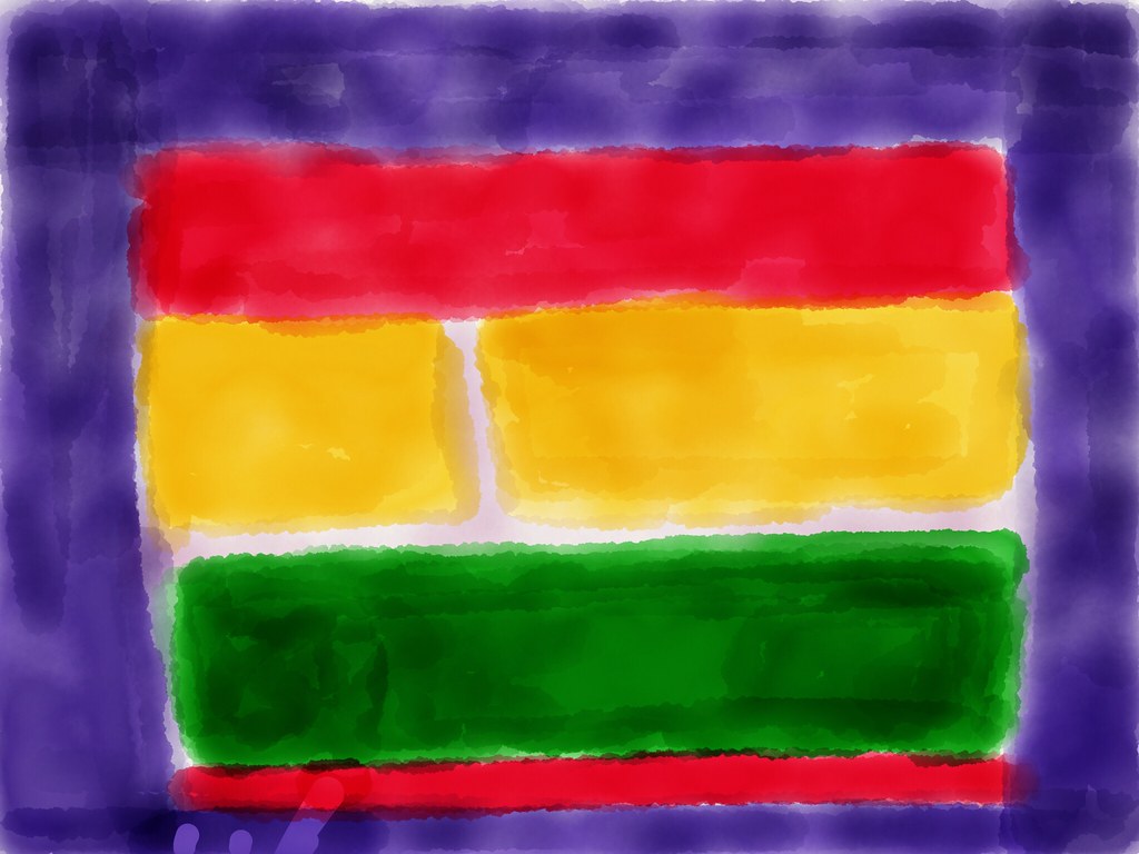
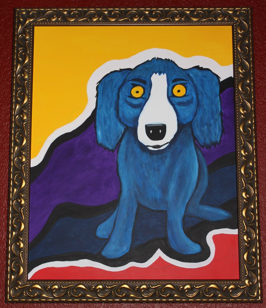
      Everyone knows famous artists such as Vincent Van Gogh, Jackson Pollock, Leonardo Da Vinci, etc. Not only are such artists ironic, but their artworks are iconic and remember able as well. This week's "The Daily Create" challenge is to re-create an image of a famous artist's artwork. You can upload a picture of your re-created artwork on http://flickr.com/ and tag it dailycreate and tdc1188.

     Seen below are some pictures of the recreations of famous artworks that some people have submitted, as well as the link to "The Daily Create".

     In conclusion, this assignment that was proposed by "The Daily Create" is quite interesting, and I hope to post my own version of a re-created famous artwork in the near future.

Link to "The Daily Create": http://tdc.ds106.us/


Seen to the left: a homage to Mark Rothko.


Seen to the left: a Blue Jaxin based on one of George Rodriguez's works.

Monday, 13 April 2015

Digital self-portrait

Digital self-portrait

Pop art digital self-portrait

       In CyberARTS, we created digital self-portraits of ourselves that will eventually be painted that best reflect how we see ourselves as well as our personalities through the art style of our choice.

       The art style that I chose was pop art. I chose pop art, since I see myself as a very animated, cartoony-type of person. I'm a fairly colourful person that can be serious at times as well. Pop art is a very quirky type of style as well-not many styles can match up to it's symbolic and rememberable nature. I'm a very quirky and iconic type of person that seems to effect others (whether positively or negatively) wherever I go as well. Although I'm not taken seriously 99.9% of the time, I still try to act out how I feel as much as I can. Pop art depicts those traits of mine, since in many of Roy Lichtenstein's pieces, (drowning girl, the melody haunts my reverie, and m-maybe girl to name a few) they display bright-eye-catching colours with a young woman stating how she feels. They also have some kind of message or underlying theme to them that almost reflect how society and pop-culture is being glamourized in our everyday lives. I wanted to express something of that sort with my self-portrait. I often times make references and break-down stereotypes and passing fads as well as popular social media celebs too. 

Down below is a JPG of my digital self-portrait that I created using Adobe Photoshop CS6 in a pop art style.

      In conclusion, I chose to create my self-portrait in the pop art Roy Lichtenstein coined dots style, since it reflects a lot of how my personality and mind points are. 


Seen to the left: My pop art self-portrait.

Saturday, 4 April 2015

CyberARTS weekly blog post #4

CyberARTS weekly blog post #4

New Technology/Tips and Tricks

       Photoshop. Some may be a skilled artisan at it, while others may just be beginners. I'm slowly but surely working my way up into becoming more of a fledgling at such a skill myself. For this week's weekly blog post, I'm going to share a neat video that I found on YouTube about matching the foreground to the background in Adobe Photoshop CS6. The video helped teach me a technique that I hadn't previously known, and it was interesting to learn more small tips and tricks that you can use here and there to alter the way that your final image appears.

 In conclusion, I'll keep trying to learn more and more Photoshop techniques, and in the future I might even be able to post up art that I created using such techniques.


Seen to the left: video on matching the foreground to the background in Adobe Photoshop CS6.

Thursday, 12 March 2015

Modern and Post-Modern art styles poster

Modern and Post-Modern art styles poster

        In CyberARTS, we were given the task of creating an informational poster that included at least 10 different art styles (7 of them were ones that weren't presented during our "Art Styles" presentation, 3 are ones that we did present). To create my picture, I used Adobe Photoshop CS6. Below is the picture of the poster that I created.


Seen to the left: a picture of my "Modern and Post-Modern Art Styles" poster that I created.


        In conclusion, the poster assignment was very structured (a grid, specific measurements, consistent sizes and fonts, and composition were key in creating this poster), but I enjoyed the overall product of what I created. Overall, the assignment was a bit intricate, but I enjoyed the process of creating it as well.

Wednesday, 4 March 2015

StarWars game cover and disc

StarWars game cover and disc

          In CyberARTS, the year two's and three's were given the task of creating a StarWars game cover and disc design in preparation for the annual "TDSB Skills Challenge". I used Adobe Photoshop CS6 in creating this, as well as InDesign as a later step in the process too. Seen below are the pictures of both the game cover that I created as well as the disc too.


Seen to the left: Picture of the StarWars game cover that I created.


Seen to the left: picture of the StarWars disc that I created.


          In conclusion, the assignment was fairly interesting, and although I won't be attending the annual "TDSB Skills Challenge", the assignment was good practice in helping me hone my skills and become more aware of different ways to arrange photos in a composition as well as text styles too.

Monday, 2 March 2015

Light bulb re-creation using Adobe Illustrator CS6

Light bulb re-creation using Adobe Illustrator CS6


            In CyberARTS, we were given the task of re-creating the image of a light bulb using shapes and the pen tool in Adobe Illustrator CS6. Featured below are the steps that I used to create the image as well as the original and my photoshopped image too.

Step 1: The first step that I took in re-creating the image of the light bulb was to open up a new Adobe Illustrator file and drag in my image of the light bulb. I then deleted the layer lock on my image and duplicated the layer. I then began to work on the duplicated layer for the rest of the assignment.

Step 2: The second step that I took in re-creating the image of the light bulb was to select the pen tool and trace around the outer bulb. Once I finished tracing the bulb with the pen tool, I filled the shape with grey paint using the "fill" tool.

Step 3: The third step that I took in re-creating the image of the light bulb was to create the base at the bottom. I used the pen tool to trace the base and I then used the gradient tool to create the illusion of having shadows and highlights while shifting around where the lights and darks would hit.

Step 4: The fourth step that I took in re-creating the image of the light bulb was to use the pen tool to create the four highlights on the bulb and the electrical foot contact (the little bump at the bottom). I then filled the highlights with gray paint and changed the outline of them to gray as well as filling the shape and stroke of the electrical foot contact with black paint too.

Step 5: The fifth step that I took in re-creating the image of the light bulb was to use the pen tool to trace the filament on the inside of the bulb. I traced around certain areas and created a gradient using separate white shapes and filling certain parts in with paint (white paint and varied shades of gray.

Step 6: The sixth step that I took in re-creating the image of the light bulb was to select the layer of the bulb's shape and use a gradient on the left side that consisted mainly of shadows to create a more "3-D" look.

Step 7: The seventh and final step that I took in re-creating the image of the light bulb was to save my file of the re-created light bulb as an Ai file and as a JPEG.

          In conclusion, this assignment was quite meticulous, due to the lack of practice that I've had with Adobe Illustrator CS6 in general. It was a curveball for sure, but allowed me to learn more about Adobe Illustrator CS6 as a whole. I'm pleased with the overall product f this assignment, and I hope to learn more about using Adobe Photoshop CS6 in the future.


Seen to the left is the original image of the light bulb.


      Seen to the left is the re-created image of the light bulb.

Wednesday, 25 February 2015

Art deco Prezi presentation

Art deco Prezi presentation

In CyberARTS, our class had to pick an art style and discuss it to the class in 3-5 minutes during a presentation. The art style that I chose was "Art deco". Here's the Prezi that I created. I hope you all enjoy it!

Saturday, 21 February 2015

CyberARTS Weekly blog post #3

CyberARTS Weekly blog post #3

Creative recordings-The Daily Create

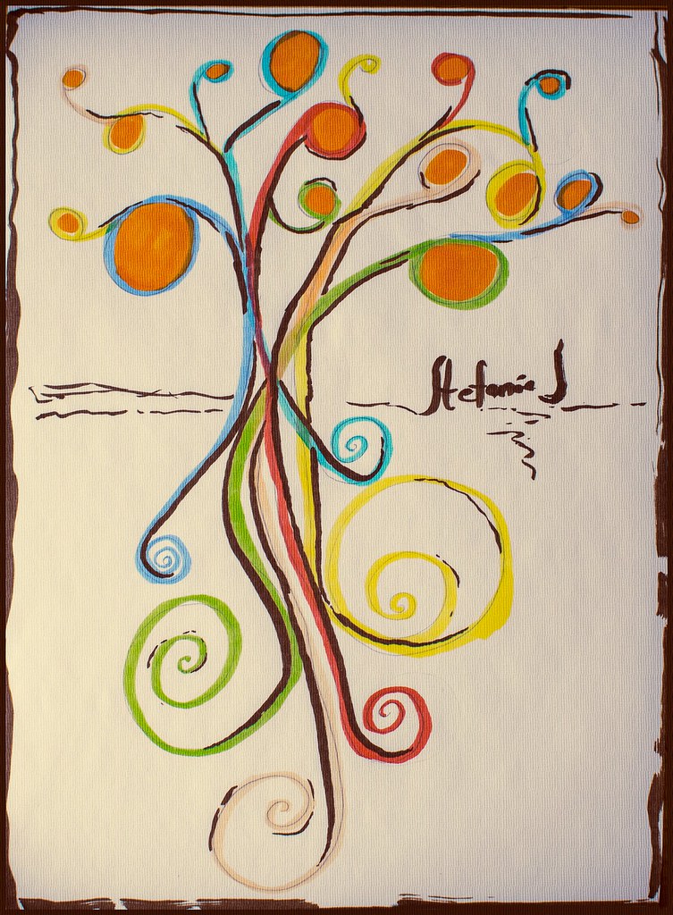
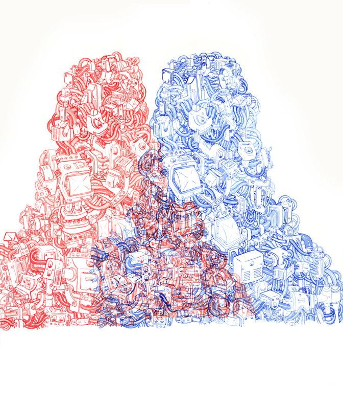
           On the CyberARTS website, there's often links to various interesting websites that feature different types of technology, tips and tricks, challenges for artists to try, etc. One of the websites that's featured is called "The Daily Create". The website "The Daily Create" features different challenges for artists to try. Once someone has completed a challenge, they can upload a picture of their finished product to Flickr and tag it dailycreate and tdc1140. This weeks challenge is to create a picture of yourself as a tree/being represented as a tree. I found this challenge to be particularly interesting, this the idea of myself being an embodiment of a tree is quite unusual and unique. I also have an eccentricity for drawing trees-especially ones in high value-and I thought of doing a high value one myself, but instead with colour. I'm currently working on it, and I'll probably post it on my blog soon too. Down below is a few pictures of entries that people have made as well as the link to "The Daily Create"and the CyberARTS website too.

Link to "The Daily Create":
http://tdc.ds106.us/

Link to the CyberARTS website to find more interesting artistic websites and such:
http://lcicyberarts.blogspot.ca/


Seen to the left is a picture that someone created and was featured on "The Daily Create".


Seen to the left is a picture that someone created and was featured on "The Daily Create".

Friday, 13 February 2015

CyberARTS Weekly blog post #2

Artistic inspiration

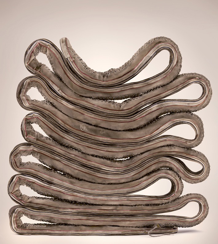
          Recently I had been searching for inspiring and/or interesting websites that showcase artist's work that I thought would be notable enough for me to write my weekly blog post on, while at the same time having some kind of impact on the way I think. The website is an art gallery-styled homepage for the user to view the works of Steven Dufala and Billy Blaise Dufala- AKA the "Dufala Brothers". On the website, there are three sections of different types of art that is categorized: Sculpture, On Paper, and Projects.
The works that are displayed are all very unique- I feel as if their purpose was to make the viewer see an ordinary object from a different point of view. Seeing the works from these two brothers encouraged me to get in touch with my inner quirky side as an artist.
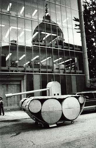
 Seen below is a couple of pieces that I personally picked out. In my opinion, the most interesting piece that I found on the website would be one of a project that the brothers constructed to create a large-scale army tank out of cardboard. Once it was created, it was sent out onto the streets and was shown to be a very "unique" way of transportation. In conclusion, this was a very interesting website that I came across, and I find the perspective of the artist's to be very different-as if it were a breath of fresh air.

 Below with the pictures is the link to the website, a link that shows fives "inspirational artistic websites", and the video of the cardboard tank.


Seen to the left is "3-D machine", watercolour made in 2011


Seen to the left is "extra long chuck", digital made in 2010 


 Seen to the left is "cardboard tank" , photo credit - pete danz


 Link to the website that shows five different "inspirational artistic websites"
http://www.creativebloq.com/web-design/artist-websites-10135048

Link to the website that I accessed to find these pieces as well as the video.
http://dufalabrothers.com/cardboard_tank.php

Video of the cardboard tank in all its glory.

Wednesday, 11 February 2015

Filter Experimentation

Filter Experimentation

            In Adobe Photoshop CS6, I began to experiment with changing and altering the appearance of backgrounds using the varied filters found under the"Filter" tab in the top-left corner of the screen. Here are the filters that I used and in order as well:
  1. Oil paint
  2. Add noise
  3. Blur (then "field blur" selected from that tab)
  4. Render (then "lens flare" selected from that tab)
  5. Lens correction
Here's the original photo and the one that I photoshopped using the varied filters.


Seen to the left is the original photo of the background.


Seen to the left is the photoshopped photo of the background that I edited using varied filters.


            In conclusion, I've always enjoyed editing and experimenting with varied filters on photos in Adobe Photoshop CS6, and this was definitely a fun little photoshop edit to brew up too. I definitely recommend playing around with varied filters in a person's spare time-it's quite interesting and delightful!

Monday, 9 February 2015

Scratch art text image

Scratch art text image

In Adobe Photoshop CS6, I learned how to create a scratch art styled image of text. I also wrote a mini tutorial of how I created this image. Here's a picture of the image I created below.


Step 1: I dragged the desired background into an Adobe Photoshop CS6 file. I then removed the background lock on the image and resized the canvas using "Canvas size", and then resized the image   itself by clicking "Free transform" so it would fit on the canvas.

Step 2: After selecting an image and resizing it, I created a second layer and filled it with white paint using the "Paint bucket tool".

Step 3: After creating a second layer and filling it with white paint, I selected the "Horizontal type mask tool" and selected onto the image to write in "Thug Life". Afterwards I changed the font to "Stencil Std" and changed the font size to 95 pt.

Step 4: Once I added in the text, I selected the "Eraser tool" and changed the eraser size to 2. I then zoomed in using the "Zoom tool", and began to erase on an angle while making sure to leave small gaps in-between the eraser strokes as well.

Step 5: After I finished creating my desire image, I selected "Save as" and saved the image twice- once as a Psd, the other as a JPEG.

In conclusion, this was a very interesting assignment to say the least. I got to experiment with finding out how certain backgrounds would look with different types of text, and I got to learn an interesting photoshop tip as well. Overall I'd say that this was a very interesting lesson on photoshop.

Friday, 6 February 2015

CyberARTS weekly blog posting #1

  Life Observation

         During the last week of January of 2015, right as first semester at Lakeshore Collegiate Institute was coming to a close, I was given a week off from classes due to final examinations being finished. During that time, I re-kindled my love for various hobbies (drawing, organizing, cleaning, etc). One of my hobbies is playing video games in fact (especially the story and adventuring-based ones). During this allotted 7 days of break from examinations, I experimented with trying out different "Life's" in a game I play on my Nintendo 3DS called "Fantasy Life". The game "Fantasy Life" is an adventure RPG-styled game that allows the player to switch between different "Life's" as often as they want. Each "Life" has a certain skill and/or power that they specify in (Mining, Alchemy, using a certain and/or specific weapon, etc).

        I first started out as a Paladin (Paladin's serve and work under the rule of the king, as his own personal type of protection. They specify in using longswords and shields. They have high defense and hp), then I moved onto a Blacksmith (Blacksmith's forge weapons using ingots that they create from melting down different types of metals and materials such as iron, gold, silver, etc. Blacksmith's have high attack, defense, and vitality), then I started "Life" as a Woodcutter (Woodcutters use their axes to chop down trees that are used in carpentry. Woodcutters have high attack, hp, and dexterity), then shortly afterwards I started "Life" as a Miner (Miner's mine precious materials such as various stones and metals that can be sold or can be used in various alchemy experiments, in a blacksmith's forge, in carpentry, etc. Miners have high attack, hp, and vitality), and afterwards I tried out the Alchemist "Life" (Alchemist's use varied materials to concoct potions, elixirs, charms, etc. Alchemist's have high special attack, and dexterity), and recently I tried out the Carpenter's "Life" (Carpenters use wood to create furniture and turn logs into beams which can be used to create furniture as well. Carpenter's have high attack and dexterity).

        Whenever the player starts out a new "Life" for the first time, they go through an introductory quest and get to know their "Life Master" as well. A "Life Master" is the character that generally helps guide the player and sends them off on a tutorial that includes a small story to it that involves the "Life Master" also. The "Life Master" generally is a quirky character that is the best in whatever "Life" it is that the user wants to currently pursue. The user also returns to the "Life Master" whenever they complete a quest (a quest is similar to a challenge or an assignment in a sense. Once the user completes a challenge, they are rewarded with points. The only way to progress and raise the ranking of that "Life" higher is by completing quests) and want to know how many points they've received from such quest. The "Life Master" also can talk and give hints to the user about varied tips and tricks on how to thrive while being in such a "Life" as well.

       When I started my "Life" as a Carpenter, I figured that the "Life Master" would be a regular, typical, confident and well-composed type of guy. What I figured was wrong, in a way that is. The "Life Master" for the Carpenter is named "Woody" (figures, doesn't it?). Woody is an absolute master at his craft (from what I've heard, that is). He seems to be the best of the best-afterall he is the "Life Master" for all Carpenter's to see. Upon immediate interaction with Woody, the player can obviously tell that he is rather nervous, timid, and isn't good with being put on the spot. In fact, he's so nervous that he often times says things that don't quite make sense. The first conversation that you have with Woody is his own description of what he feels that carpentry is. The old saying "life is a lot like a box of chocolates, you never know what your gonna get" reminds me of this- in a way that is. The way that he jumbles his speech and takes a spin on an old saying that relates to life and how the game "Fantasy Life" revolves around the user choosing a "Life" really reminded me of that. I generally enjoy humour that comes from odd places and speech being twisted with puns being made as well, such as "Corner Gas", a Canadian television show that includes such witty-humour. Seeing this conversation really made my day, and inspired me to think a little bit differently.
Below is some snapshots that I took using a camera of the first conversation that the player has with Woody.


Seen to the left is the first picture from the conversation about carpentry.


Seen to the left is the second picture from the conversation about carpentry.


Thursday, 5 February 2015

Stephen Harper edited picture for Rick Mercer photo challenge

Stephen Harper edited picture for Rick Mercer photo challenge

                   In CyberARTS, we watched a video that went over different types of text enabling techniques in Adobe Photoshop CS6. We were then introduced to the "Rick Mercer photo challenge", which is a challenge featured on the Rick Mercer website. The challenge that the website poses is for the photoshopper to create a photoshopped image of a politician. The politician selected this time was none other than Canada's Prime Minister, Stephen Harper. For this assignment, I chose to depict Stephen Harper with a golden frame around him containing hot-pink text saying "Stephen Harper=hardcore Brony", while the background being that of a "My Little Pony" scene with various ponies being seen as well. Below is the instructional guide that I've created to show the steps that I took to create this image.

         
 Seen above is the photoshopped image of Stephen Harper that I created.


Step 1: Once having the image of Stephen Harper opened in an Adobe Photoshop CS6 file, I then used the quick-selection tool to select Stephen Harper. I then used refine edge to clean up the bits and pieces of the background in the image. Afterwards I selected "decontaminate colours" from the output section from the refine edge bar, and then chose "New Layer with Layer mask".

Step 2: After having Stephen Harper selected out of his background, I dragged a background into Photoshop of my choice- a "My Little Pony" picture. Once the new tab that contained the background was displayed, I went back to the tab that contained Stephen Harper, and I clicked on the "Move Tool", then command-clicked on the layer mask, then onto the regular photo of him on the left from the same layer. I then dragged the image of his body onto the background layer.

Step 3: After having Stephen Harper being placed onto the background, I picked an image of a golden frame for Stephen Harper to hold. I dragged the image of the frame into Photoshop, and I then repeated step 1 and 2 for the frame. I then dragged the frame onto the tab that Stephen Harper was on.

Step 4: The final step I took was creating the text. I selected the Horizontal type tool and moused over the upper-edge of the bottom half of the frame. I clicked on the area and began to type my desired message. Afterwards I selected the font from the top of the screens text bar, increased the font size, and set the font colour.

Step 5: After I finished photoshopping my image, I selected "save as" and saved my image twice- once as a psd file, the other as a jpeg.

           In conclusion, the assignment was very interesting (you don't get to photoshop the Prime Minister of Canada everyday), and I found the tips and tricks that I learned on how to control and use the text tool from Adobe Photoshop CS6 to be very intuitive and inspiring.

Sunday, 16 February 2014

Photoshop edited image with coloured pencil filter

Photoshop edited image with coloured pencil filter

Photoshop edited image with coloured pencil filter


In Photoshop Elements 8,I edited this image that I took a couple of months ago of a person standing to the right of a sidewalk. Not only does this to the right placing make the image seem more balanced, but this also makes it look more visually appealing, and I also think that it adds depth to the image as well.

 I used the quick selection tool, selected a majority of the sidewalk and the person, and then used the coloured pencil filter to give the selected areas that "rough, sketchy look". I then used a high contrast filter afterwards to give the person that "illuminated, glowy" look. By doing this it makes the image seem balanced, makes it feel to have a very unique element that doesn't clash, but instead blend with the piece, and makes it seem to be more professional and creative as well too.

 I feel that the image turned out well, and I enjoyed creating it on my laptop. Try using different filters and programs with old images that you have on your computer, who knows, maybe you'll end up making a masterpiece! Hope you enjoyed this image, and I hope you have a happy day! 

Monday, 20 January 2014

Digital Surrealism Artist Statement- Rob Ford in an oven

Digital Surrealism Artist Statement

Rob Ford in an oven


For our CyberARTS class, we had to create a surreal image while using 3 photos ( one of which we had to shoot with our own camera) to portray a message of something that we had an opinion on/ and or felt strongly about. For my Digital Surrealism photo, I decided to put Toronto's own mayor Rob Ford in a standard cooking kitchen oven, displaying him being baked/ "cooked". Many people have heard rumors and stories about mayor Rob Ford in the news lately. They've heard  gossip and factoids from drug scandals, to potential homicide charges, all the way up to "having enough to eat at home". Even with all this evidence, what is there to prove? The only response that I could think of was that our own mayor Rob Ford was being roasted- no, he was being cooked- cooked like a turkey. I thought that by placing Rob Ford in an oven while displaying him being "cooked" showed a symbol of what happens when you're put in a tough position/ and or are being prosecuted or criticized, especially when you're in high power- or just a mayor of Toronto. The effects aren't devastating on the public, but instead on the victim. This photo helps to symbolize and exert the message that if you're backed into a corner, you might as well call yourself done for (or in this case, cooked). I tried to use a head shot photo (or anything as close to a head shot photo) of Rob Ford to help focus on mainly his facial expressions. In many cultures, they'd roast the head of a boar and eat it with mustard at around Christmas time, so I thought that by using the head of mayor Rob Ford, I could almost create the same image. I used an image of Rob Ford that had him making a very quirky and suspicious facial expression (as if he was surprised or if someone jumped on his stomach and scared him meanwhile waking him up in the middle of the night). I thought that this facial expression would help to add the effect of being prosecuted as well too. I added in the carrots all along the edges of the oven pan to help top off this image. The carrots help the viewer quickly connect the dots to understanding the image and itself as a piece, and also adds to the "cooking" theme of this piece as well.

I originally had various ideas for this assignment, but after many trials and errors, I had the idea to "cook" our mayor from thinking of ironic symbols and messages to show to the audience to convince or represent something to them. I had drawn up a few sketches, some of which include our mayor lying horizontally on an open grill with a shish kabob skewer going through him garnished with vegetables, him lying down in an oven pan and being roasted while appearing to be caramelized, and the final sketch which was of him sitting in an oven pan being cooked. Once I knew what my idea was, I began to compile images to use for this project. I selected an image of Rob and some carrots from the internet, while I took the picture of the oven myself. I made some notes about the steps and processes that I would want to use and how to take them. After reviewing my notes, watching some videos and tutorials, and playing around and trying different tools and techniques, I was finally ready to get to work. I started off by opening a new Adobe Photoshop CS6 file, then I opened up the image of the oven, then the image of Rob Ford. I dragged Rob Ford onto the file of the oven and then deleted the lock on the oven's background layer. I used the "free transform tool" found under "edit", and then re-sized the image of Rob Ford. After that I used the "quick selection tool" and selected the areas of Rob Ford that I wanted to have show up on the background (oven layer). After selecting the areas, I then used "refine edge, changed "view mode" to "on layers", changed "edge detection" to "smart radius" and changed the radius and used the "paintbrush tool" to paint around Rob to erase and correct any mistakes that I see. I changed some of the different edge types in "adjust edge", and selected "decontaminate colours" in "output" and played around with that option a little bit. I selected the "output" to "new layer with mask". I then went to "adjustments", then "exposure" and then I lowered the exposure. Afterwards I moused over the new layer that I made, and held down the command key, clicked on the layer, then selected "layer via copy" in the "layers" tab. I then clicked on the new layer and dragged it all the way to the top. I then clicked on "normal" (an option setting which can change different styles the image can have), and changed it to "colour" and then lowered the opacity. Afterwards, I applied this process when using the image of the carrots as well. I duplicated the image of the carrots so that way I would have more carrots to use in the image-thus making the image seem more natural. I played around with different filters, adjustments, masks, and other tools to help create the image of Rob Ford being "cooked". I used "colour balance" to greatly increase the red amount in the background (oven) and in the mid tones to make the oven appear to be working and hot.

After completing this project, I discovered that if you look into and research something that you want to learn, then you'll find all sorts of information and help on the internet to use. I also learned that sometimes unusual images can work well together if the proper setting and adjustments are used/ and or made. Generally I'm not very "tech chic", and I wasn't too sure about how I could execute the surreal image that I've created in a definitely natural and proper way, but after learning and discovering new techniques and options in Adobe Photoshop CS6, I feel that I'm becoming pretty well versed in using Adobe Photoshop CS6, and now I feel more confident in my tech and computer image editing skills too. At the end of this project, I feel that the image that I've created actually turned out pretty well. I feel that the image's blending looks decent, the hues worked well together and helped to create unity, and there's little to no mistakes or issues with the image that are visually noticeable itself. I also feel that the image carries across it's symbolism and message pretty strongly. In conclusion, I had a lot of fun learning about and trying different techniques in Adobe Photoshop CS6, and I got to put Rob Ford in an oven which is always a fun activity to do too. I'm glad that I got the opportunity to complete this assignment while experimenting and learning as well, and I feel that I got to use my time efficiently and was able to enjoy this assignment too.