Saturday 17 September 2016

Copyright and Fair Use for art on YouTube

        Copyright has been an issue in the art community for many years. For some, they see copyright laws as a step towards independence as a creator by finding ways to take back earnings or to stop another person from continuous use and/or sale of their product/creation.

  On YouTube, content creators face the same risks when producing videos. YouTube has it's own copyright system which allows people with accounts to send in claims to YouTube in regards to the content that someone has made, whether it be 1 video or 100 videos, networks and users alike can choose to send in a claim on someone's video if they feel that it is copyright infringement. The type of infringement that I feel strongly about is the "Fair Use" clause in regards to YouTube's guidelines for striking videos.

        In my opinion, where there's great opportunity to improve, there's also great opportunity to lose. There have been many cases of people getting unfair Fair Use claims and strikes placed on their YouTube videos due to people falsely claiming their videos on purpose and abusing the system, and even by misunderstanding the Fair Use clause. There are even some cases where the video's monitisation ( the money that the YouTube content creator receives from the amount of views per video usually) is switched from going to the original content creator's pocket to the false claimer's pocket. Because of this, many people who make their living from making YouTube videos are at risk of losing their paycheck from their hard work. Imagine how horrible it would feel to have worked on a painting for about 5 or 7 days, and to bring it to an auction house for it to be sold, only to have someone else put their name on the back of your canvas and make hundreds or even thousands of dollars off of it. Despairing, right?

But what exactly makes a video fall under "Fair Use"? If you're using someone's video in your own, it becomes "Fair Use" if you've: altered the video, used only the necessary clips/audio to emphasize your point in your video, and many other smaller subject areas.

Down below are some videos about a YouTube content creator named Pyrocynical. He's a Youtube content creator with around 1.4 million subscribers. He makes commentary and reaction videos. A few months back, he created a reaction video to a prank that a smaller YouTube content creator nicknamed Riceman with around 200,000 subscribers created. In this prank, Riceman pranked his mother by making her think that he committed suicide by hanging himself. In Pyrocynical's video, he reacted to this video and gave some feedback and criticism on the prank that he played, seeing it as cruel and tasteless. Riceman put in a claim to demonitise Pyrocynical's video even though it fell under the Fair Use clause. Because of this, all the earnings that the video was making was being transferred over to Riceman instead of Pyrocynical. Down below are the videos that tell the story of what happened to Pyrocynical.

Overall, I've seen the Fair Use clause on YouTube hurt more people than it's helped, and I personally think that Fair Use is in the eye of the beholder. Even with strict YouTube policing, there's always going to be someone getting the "short end of the stick" due to the broken legalities and copyright and Fair Use system that YouTube has. It's just a matter of time before it happens to someone like me or you.

Here's a link to YouTube's on guide to Fair Use.
YouTube's own guide to Fair Use


To the left: The original video that Pyrocynical made in reaction to Riceman's prank video.


To the right: The 1st video that Pyrocynical has released about his demonitised video. 


To the right: The 2nd video that Pyrocynical has released about his demonitised video. 


BONUS:
A series of videos on a similar Fair Use case that happened to reaction and skit-makers, h3h3 on a reaction video they did on another YouTube content creator, Matt Hosseinzadeh AKA "The Bold Guy". This case, however, ended in a lawsuit that potentially cost h3h3 up to 100,000 dollars. Luckily, they were able to pool together donations from a fundraising campaign started by another YouTube content creator, Philip DeFranco.


To the right: The video from h3h3 productions that entails the situation of their lawsuit from Matt Hosseinzadeh (The Bold Guy).


To the right: A re-upload of the video that h3h3 posted that resulted in copyright issues with Matt Hosseinzadeh (The Bold Guy).

Links to:

YouTube's guide to Fair Use 

Video of Pyrocynical's reaction to Riceman's prank 

 Pyrocynical's 1st video on his demonitisation situation

 Pyrocynical's 2nd video on his demonitisation situation

Video explaining h3h3's lawsuit

The re-upload of the video made by h3h3 that was copyright striked.


Friday 6 November 2015

ELF Trailer-Incomplete

ELF Trailer-Incomplete


   In CyberARTS, we were given the task of creating a movie trailer that completely flips around the genre of the movie. I chose to make a movie trailer for "ELF", and I turned the comedy into a psychological thriller.


Seen left: the re-vamped ELF movie trailer that I created.

Seen below: original ELF movie trailer.
For this trailer, I used the Death Note theme "Boredom" as the monotonous eerie background music, and I added the intro at the beginning of "elves like to tell stories" to add the element of suspicion, trying to set the tone of not feeling safe with the environment. 

Tuesday 16 June 2015

Year 2 tech culminating

Year 2 tech culminating


For my grade 10 CyberARTS culminating, I created a poster and a web banner based around an event called the "graphics jam". In my opinion, I interpreted the event as a quirky take on a "popping", "new-age-meets-re-vamped-customs" type of matter.

For my creative process, I knew that I wanted to do something that incorporated a jar of jam (a "play on words", with the "jam"). I started by researching pictures of real jars of jam, as well as clip-art to get a feel of the shape and the appearance of the jar. I found some interesting images, and I even saved one of the clip-art's onto my desktop for reference. Afterwards, I searched up "graphic jam" on Google images- to try and see what would show up, in hopes of finding existing examples of posters and web banners that would help inspire me. Unfortunately, I didn't find any existing examples of graphics pertaining to that of the fictional event that I was creating a poster and web banner for. Being crestfallen, I decided to set my search up for something else-the type of design/style that I wanted to gear my main idea towards. I searched up "stylized posters", and I was quite interested in the results that I got (art deco-styled posters with a clear layout). I decided to go with a design based off of what I found. I made some sketches in my tech sketchbook, and I decided on what I might incorporate in my design.

The imagery that I created was of the jar of jam, and I made sure to create a jar of jam that had a fabric cover that acted as a blanket for the cap of the jar, as to help give the poster and web banner a quirky, "new-age-meets-re-vamped-customs" feel (back in pioneer days and in the Amish lifestyle, they used to preserve foods with this method). By using quirky, sweet colours in the jar, it helped show the quirky message that I was trying to get across.

With my design choices, I chose to keep the poster simple and clean. With that kept in mind, I tried to keep the visual hierarchy balanced. I had the name of the event, "graphics jam", in a large font, and at the top (with a few inches of space between the caption and the top of the composition), as to be eye-catching and to make it obvious that it was the caption. I then had the month, year, and the days that the event took place (Feb 12-21 2016) right below the caption, snuggled under the part "grap" in "graphics", and to the left of the "j" in "jam". I then wrote the location of the event (Artscape Wychwood Barn) underneath the word "jam". I put the jar of jam in the bottom left-hand corner of the screen, so your eye would be lead to it (it's the focal point of the piece). For the banner, I put the month, dates, and year in a medium-sized font in top left-hand corner of the banner. I then put the jar of jam in a small size, in the middle of the screen, as to balance the composition. I then put the caption "graphic jam" in a large font, at the right-hand corner of the screen.


Overall, I'm fairly satisfied with my work, and I enjoy the effect that I created with my poster and banner as well.


Seen to the left: Poster of the event "graphic jam" that I created.
Seen to the left: Web banner of the event "graphic jam" that I created.


Friday 1 May 2015

Painting panel

Painting panel

    In CyberARTS, we created large-scale paintings using house paint in preparation for our self-portraits that we'll be painting based off of our digital self-portraits (you can find my digital self-portrait on this blog).
   
    For this assignment we had to incorporate a gradient background, 6 techniques, and a blended sphere. My 6 techniques were: dry brushing, stencilling, mark-making, wash, bold lines, scraffito, and an additional technique that I added in (splatter), making it a grand total of 7 techniques.
   
    In conclusion, this assignment was one of my favourites to perform (painting is a hobby of mine, so I naturally latched onto this assignment with joy), and I hope my self-portrait can turn out as beautifully as this painting turned out.


Seen to the left: a painting that I created using house paint that incorporated a minimum of 6 techniques, a gradient background, and a blended sphere.

Wednesday 29 April 2015

Typography exploration

Typography exploration

     Typography. It can express the energy that a word gives, sounds, or even feels. Using Adobe Illustrator CS6, we were given the task of picking a word and picking out the details to help express what that word represents in terms of feelings, mood, sound, etc. The word that I picked was "Utopia".

The word "Utopia" (pronounced UU-Toe-pEE-AH) is defined as an "imagined place or state of things in which everything is perfect."

     When I hear the word "Utopia", I envision a tropical hideaway far from the loud hustle-bustle of modern living. Somewhere like a island in the middle of nowhere with a cascading waterfall, lush flowers, chirping birds, etc. I hear the gentle breeze, the melodic strings of a harp being plucked by that of a gentle, long-haired, kind goddess, and the beauty of nature being exposed fully.

    The type of font as well as it's composition and format is crucial to helping convey the intended message and express the feeling of a piece of text. I downloaded a font off of a website to use so that way I could open my options up as much as possible for finding the "perfect" font. I used "Scriptina" font for the word "Utopia" at size 107.53 points. I changed the colouring of each letter in the word "Utopia" to create a range of colours that mimic a rainbow. I used mostly light colours, however, to create a light sense rather than having heavy dark colours hanging on the screen. I placed the word to the mid-left of the screen to create a "rule-of-thirdsworthy" balance (having something not directly centre for visual interest). I then type my description of the word "Utopia" underneath with a bit of space in-between as to let the text have some room to breathe. The description was "Lao Sangam MN" font, size 16 points.

     In conclusion, I really enjoyed the concept of the given work, and I hope to learn more and try new options when it comes to typography as well.

     Down below is my typographic creation of the word "Utopia", as well as an image coupled with some audio that I thought perfectly define how I envision the word "Utopia".


Seen to the left: the typographic image that I created of the word "Utopia".


Seen to the left: an image that helps define how I envision the word "Utopia".


Seen to the left: an audio track that helps define how I envision the word "Utopia".

Tuesday 14 April 2015

CyberARTS weekly blog post #5

CyberARTS weekly blog post #5

Creative recordings- The Daily Create 

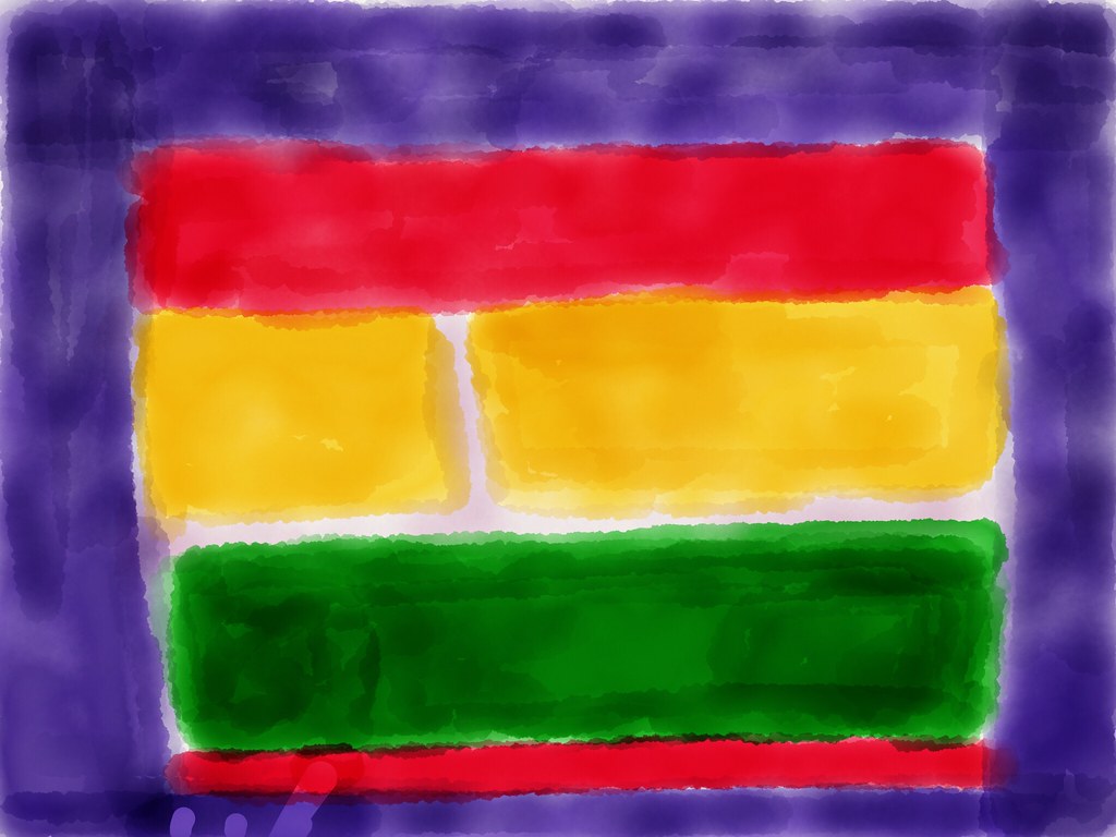
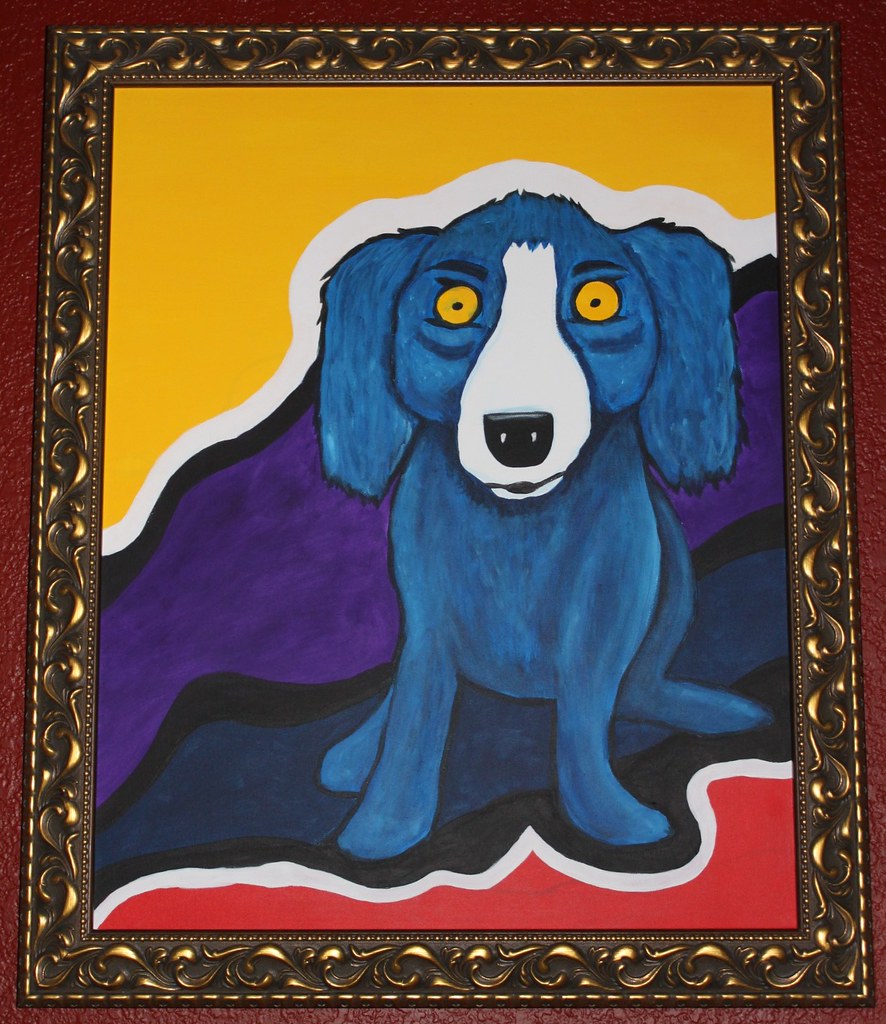
      Everyone knows famous artists such as Vincent Van Gogh, Jackson Pollock, Leonardo Da Vinci, etc. Not only are such artists ironic, but their artworks are iconic and remember able as well. This week's "The Daily Create" challenge is to re-create an image of a famous artist's artwork. You can upload a picture of your re-created artwork on http://flickr.com/ and tag it dailycreate and tdc1188.

     Seen below are some pictures of the recreations of famous artworks that some people have submitted, as well as the link to "The Daily Create".

     In conclusion, this assignment that was proposed by "The Daily Create" is quite interesting, and I hope to post my own version of a re-created famous artwork in the near future.

Link to "The Daily Create": http://tdc.ds106.us/


Seen to the left: a homage to Mark Rothko.


Seen to the left: a Blue Jaxin based on one of George Rodriguez's works.

Monday 13 April 2015

Digital self-portrait

Digital self-portrait

Pop art digital self-portrait

       In CyberARTS, we created digital self-portraits of ourselves that will eventually be painted that best reflect how we see ourselves as well as our personalities through the art style of our choice.

       The art style that I chose was pop art. I chose pop art, since I see myself as a very animated, cartoony-type of person. I'm a fairly colourful person that can be serious at times as well. Pop art is a very quirky type of style as well-not many styles can match up to it's symbolic and rememberable nature. I'm a very quirky and iconic type of person that seems to effect others (whether positively or negatively) wherever I go as well. Although I'm not taken seriously 99.9% of the time, I still try to act out how I feel as much as I can. Pop art depicts those traits of mine, since in many of Roy Lichtenstein's pieces, (drowning girl, the melody haunts my reverie, and m-maybe girl to name a few) they display bright-eye-catching colours with a young woman stating how she feels. They also have some kind of message or underlying theme to them that almost reflect how society and pop-culture is being glamourized in our everyday lives. I wanted to express something of that sort with my self-portrait. I often times make references and break-down stereotypes and passing fads as well as popular social media celebs too. 

Down below is a JPG of my digital self-portrait that I created using Adobe Photoshop CS6 in a pop art style.

      In conclusion, I chose to create my self-portrait in the pop art Roy Lichtenstein coined dots style, since it reflects a lot of how my personality and mind points are. 


Seen to the left: My pop art self-portrait.